![SotT-LargeLogo-SansDetour]()
It’s been a little quiet recently with the “State of the Tentacle” interview series here on Cthulhu Reborn. This has been partly due to the fact that we’ve been busy with other things … but has mainly been because everyone in the Lovecraftian RPG scene (including all the folks we want to interview) is really, REALLY, busy. The past few months alone have seen no less than five huge Kickstarter projects for Cthulhu-related gaming books, and if you layer on the top of that the fact that several new companies have come onboard as Cthulhu licensees … this is starting to look like something of a boom period for the hobby.
With all that in mind, we’ve decided it’s probably time to wrap up the “State of the Tentacle 2013″ … but not before we publish one more, very special, interview.
![sott-appel-de-cthulhu-logo]() One of the things that prompted the idea of interviewing the current crop of Lovecraftian RPG publishers and authors was an interest in where this hobby is going, both in terms of the types of books being produced and the production values that are being brought to those books. Right from the start one group of folks we here at CR were very keen to talk to were the good people at Sans-Détour, the current French licensee of Call of Cthulhu. In just a few short years, this company has grabbed everyone’s attention by producing some of the most beautiful and artistically-rendered Lovecraftian books that have ever been created. Many English-speakers (myself included) have looked on in awe and envy at the quality of the Sans-Détour 30th Anniversary edition of the CoC rules; and have gasped at the gorgeous S-D presentation of Masks of Nyarlathotep, complete with a super-deluxe limited edition which came in a custom-designed leather satchel! With an Elder Sign!
One of the things that prompted the idea of interviewing the current crop of Lovecraftian RPG publishers and authors was an interest in where this hobby is going, both in terms of the types of books being produced and the production values that are being brought to those books. Right from the start one group of folks we here at CR were very keen to talk to were the good people at Sans-Détour, the current French licensee of Call of Cthulhu. In just a few short years, this company has grabbed everyone’s attention by producing some of the most beautiful and artistically-rendered Lovecraftian books that have ever been created. Many English-speakers (myself included) have looked on in awe and envy at the quality of the Sans-Détour 30th Anniversary edition of the CoC rules; and have gasped at the gorgeous S-D presentation of Masks of Nyarlathotep, complete with a super-deluxe limited edition which came in a custom-designed leather satchel! With an Elder Sign!
![]()
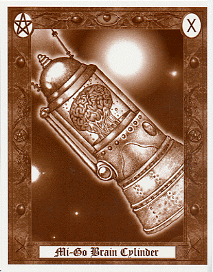
But it’s not just the super-high production values which distinguish Sans-Détour’s books … it’s also the company’s commitment to bringing out (or reprinting) compelling new gaming material, borrowing the best from the English-language version of the game but also mixing their own equally-detailed French setting. They also have an enviable programme of engaging with players at events and conventions. All these things make Sans-Détour just the kind of guys whose brains we would love to put into Mi-go brain cases and quiz for a while about the future of Lovecraftian gaming. Thankfully they were willing to undergo the procedure. We wish them a speedy recovery :-)
Introduction
![]()
Daryl Hutchinson
We we actually fortunate enough to speak with not one, but three of the leading figures at Sans-Détour. By way of introduction, these august gentlemen were:
- Samuel Tarapacki, Co-founder of Editions Sans Détour, and the guy in charge of communication. Samuel (who’s 49) has been a Call of Cthulhu player for 31 years and was the writer of the two campaigns published in the French 6th edition rulebooks, which aim to provide refreshing stories for both old and new players. In his words: “Working on the French Call of Cthulhu RPG line has been a dream come true… if you work hard, never give up, anything goes!”
- Christian Grussi, Co-founder of Editions Sans Détour, in charge of Art direction. Christian (40 years old) also has a long term involvement with Call of Cthulhu player, having played for 27 years. He is author of the French 6thedition and also wrote the French 1920s sourcebook “Au Coeur des Années 20”. He also designed / wrote the beautiful French gamemaster screen published in 2008 and later re-published by Chaosium in English in 2012.
![sott - Sans_détour_logo]() Piotr Borowski, Co-founder of Editions Sans Détour, and the guy in charge of financial management. Piotr (36) has played Call of Cthulhu for 22 years. In his words, he’s “proud to be working on this game and taking charge of the management of an impressive game legacy.”
Piotr Borowski, Co-founder of Editions Sans Détour, and the guy in charge of financial management. Piotr (36) has played Call of Cthulhu for 22 years. In his words, he’s “proud to be working on this game and taking charge of the management of an impressive game legacy.”
Now, introductions aside … let’s hear what these knowledgeable French gentleman had to say!
Cthulhu Reborn: With over three decades of history to Lovecraftian Roleplaying, what do you see as the key milestones and mis-steps that have been made during its evolution?
![]()
courtesy: neatorama.com
Sans-Detour: As paradoxical as it sounds, the most defining feature of Call of Cthulhu’s history is the fact that its rules have never really changed from the original system. This continuity has provided not only a high degree of compatibility between the different versions and editions of Call of Cthulhu, but also provide a “bridge” of sorts between the US and Europe. No matter whether you are a newcomer to the game or a veteran, no matter which country you live in, you are playing the same game with the same rules. The game is a common thread of inspiration that binds us all across time and space.
Right from the very beginning of the game, Call of Cthulhu gamers have welcomed books which explore different historical eras (such as Dark Ages and Gaslight), strange places (like the Dreamlands) and different geographical settings (the “Secrets of” series).
![]() Even after 30 years of published sourcebooks, gamers still retain the same level of curiosity about the expanse of the Call of Cthulhu universe.
Even after 30 years of published sourcebooks, gamers still retain the same level of curiosity about the expanse of the Call of Cthulhu universe.
While the game has gone through some evolution over its history, essentially it plays the same as it did on the first day it was published. Investigators are still powerless figures battling against overwhelming and cosmic threats. Their fight is something that can never truly be “won”, but is crucial to saving just a little bit more time for humanity … even if it’s just another 30 years.
CR: Given the many and varied publishers and product lines that exist in 2013 to support the hobby, what things do you think this “mini-industry” is doing well and what could be done better?
S-D: The roleplaying game enhances and expands the Cthulhu Mythos. Over the past 30 years there have been more game scenarios written involving the Mythos than there have been Mythos novels written in the last century (since Lovecraft’s day) …
It’s obvious from reading these publications that those who write and publish for the game treat the Cthulhu Mythos with a great deal of respect. There is no room for trashy, low-quality books. The Internet has helped greatly in keeping in touch with everything that is being created for Call of Cthulhu, right around the planet. We can look on in admiration at what others have done for the game, and that helps us strive to do better in the next books we create. It’s like a very positive type of artistic “competition” … which benefits players by delivering a constant stream of better books.
The setting of the 1920s and 1930s offers lots of potential for creating books which are rich with historical detail, complete with period pictures and scenarios inspired by real-world events. All of this makes for a game that is immersive and enjoyable.
![]()
One thing that this “mini-industry” could do better, though, is to develop more cooperation between the different Call of Cthulhu efforts in different countries. That would let everyone share their best ideas and share the costs of creating beautiful illustrations, conducting extensive historical research, or writing epic campaigns. Sharing those costs would allow everyone to attempt even more ambitious projects.
CR: What do you see as the main factors shaping the direction of Lovecraftian RPGs right now?
S-D: Today, one of the main things which seems to seduce game masters and players alike is the fact that the game is based in a historical setting. This creates the opportunity to extend the game by describing other new historical period and also by writing sourcebooks which provide more detail about the game’s established periods. We meet more and more gamers who are “junior historians” with ideas for new projects and for eras that have never been described for Call of Cthulhu before.
![]()
![]()
![]()
![Clear Divider 700x10]() Call of Cthulhu has a big advantage when it comes to gameplay. It is a simple game, but one with enough realism to allow a player to immerse themselves in a role and play a part in great stories. The game balances simplicity and realism in a very effective way which discourages endless sourcebooks being published just to add new rules to the game. That means that every player knows that when reading a new book he will be easily able to quickly find the relevant facts without wasting time learning new rules or flipping through multiple books searching for rules.
Call of Cthulhu has a big advantage when it comes to gameplay. It is a simple game, but one with enough realism to allow a player to immerse themselves in a role and play a part in great stories. The game balances simplicity and realism in a very effective way which discourages endless sourcebooks being published just to add new rules to the game. That means that every player knows that when reading a new book he will be easily able to quickly find the relevant facts without wasting time learning new rules or flipping through multiple books searching for rules.
CR: What do you see as the main challenges currently facing the continued prosperity/growth of the hobby?
![sott-french-cthulhu-atlas04-z]() S-D: We, as publishers, have an obligation to make our books more attractive to younger generations of gamers. They need to be simple and easy to understand to readers both novice and expert. A product line that is 30 years old can easily seem overwhelming to someone who is thinking of taking their first step into this universe. Hopefully, experienced gamers can provide a lot of the assistance required to help new players discover this hobby.
S-D: We, as publishers, have an obligation to make our books more attractive to younger generations of gamers. They need to be simple and easy to understand to readers both novice and expert. A product line that is 30 years old can easily seem overwhelming to someone who is thinking of taking their first step into this universe. Hopefully, experienced gamers can provide a lot of the assistance required to help new players discover this hobby.
When we attend events we see that many younger players know what Call of Cthulhu is or have even played the game themselves. We see it as our job to give those new players the right tools for them to continue to have fun in this game.
CR: If it was up to you, where would you like to see the product lines of Lovecraftian RPGs (whether it’s the games themselves or their support products) go next?
S-D: Call of Cthulhu needs to keep the ability it has right now to talk equally to new and experienced gamers. As long as there are writers to create great adventures and campaigns, the game can continue to forge new ground in the RPG industry. Publishers should strive to make their books more “plug and play” (i.e., easily playable with only minimal preparation time) as that makes them equally appealing to both old and new players and also continues to enhance the benefits of the system’s simplicity.
![sott-plug-and-play-tentacle]()
Maybe there is some scope for simplifying products still further to reduce the work of the game master, making it easier and more fun to prepare for a session.
CR: Hypothetically, if you were to gaze into a crystal ball and look five years into the future of the hobby, what do you expect you’d see had changed in that time?
S-D: People will always love owning beautiful books made from paper coming from ecologically-managed forests
![]()
from Sans-Detour revised edition of “Beyond the Mountains of Madness”
The melting of the ice caps will allow us to finally discover the Mountains of Madness, while Deep One colonies spawn and thrive in new underwater realms …
![]()
Courtesy: Innsmouth on DeviantArt
But more seriously … we can see a future in which weighty sets of rules are a thing of the past and the focus of publication is directed to historical detail and adventures. Gamers from time-to-time try out new games, but they seem to always come back to Call of Cthulhu proving the value of its easy gameplay and rich universe.
Maybe one day automated translation tools will become good enough that players all over the world will be able to discover and play new books as soon as they are published in any country.
CR: Thanks Christian, Samuel, and Piotr for being Cthulhu’s “French ambassadors”!
![]()
![]()
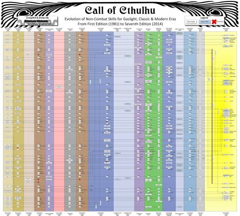 (click on the image for a larger JPEG version)
 The Descent of Skills (as a single, gigantic page)


 Unquestionably one of the most loved and enduring pieces ever written for Call of Cthulhu (or any Lovecraftian RPG) is the classic Masks of Nyarlathotep campaign. Despite the fact that it was written almost 30 years ago when the field was in its infancy it still tops most polls and was mentioned as a defining moment by pretty much every gaming luminary I interviewed for the


 Even after 30 years of published sourcebooks, gamers still retain the same level of curiosity about the expanse of the Call of Cthulhu universe.


 I’m sure by now that many people have heard about the “new kid on the block” in Call of Cthulhu publishing, Oscar Rios’ Golden Goblin Publishing. The flagship product which launched this new endeavour was a successful Kickstarter for a book called “Island of Ignorance (The Third Cthulhu Companion).” This book collects a miscellany of interesting source material along with five highly-regarded scenarios. On all fronts this is an excellent book. If you were a Kickstarter backer for a printer copy, you probably have yours by now — and if you weren’t a backer you can now buy a copy (either PDF or softcopy) direct from


 If this sounds like your sort of thing, I would very much suggest scooting over to the Internet Archive (archive.org) which collects most of the GV Sound releases


 I’m sure by now that many people have heard about the “new kid on the block” in Call of Cthulhu publishing, Oscar Rios’ Golden Goblin Publishing. The flagship product which launched this new endeavour was a successful Kickstarter for a book called “Island of Ignorance (The Third Cthulhu Companion).” This book collects a miscellany of interesting source material along with five highly-regarded scenarios. On all fronts this is an excellent book. If you were a Kickstarter backer for a printer copy, you probably have yours by now — and if you weren’t a backer you can now buy a copy (either PDF or softcopy) direct from